
Hey, has this ever happened to you?
You're spending a couple hours building the perfect spreadsheet (or I guess website for this audience) and you want to overhaul your colour palette? wouldn't it be nice to get everything the same lightness and brightness and evenly spaced along the rainbow? it can't be hard, just switch over to a HSL colour picker and set saturation and luminosity values, 360 divided by the total colours you'd like and:

Oh. well that's not quite what I'm after, the blue and yellow are clearly different lightnesses.

Ew. That's Disgusting.
Is a mathematically perfect rainbow colour palette impossible? Enter OKLCH; the only colour space bold enough to expose colour vision for what it truly is, a fucked up dream caused by miniscule differences in electromagnetic radiation. I've always had a passion for colours, it's what drew me to art in the first place, and I love defining a colour palette, or lining up my pens in aesthetically pleasing orders, so when I first discovered this system it was like the heavens parting. This colour system shone celestial light down upon me and I realised everything that was wrong with my life could simply be explained by the differences in human colour perception and computer colour display. I have to wax poetic because as soon as I show you the model, you will get scared.
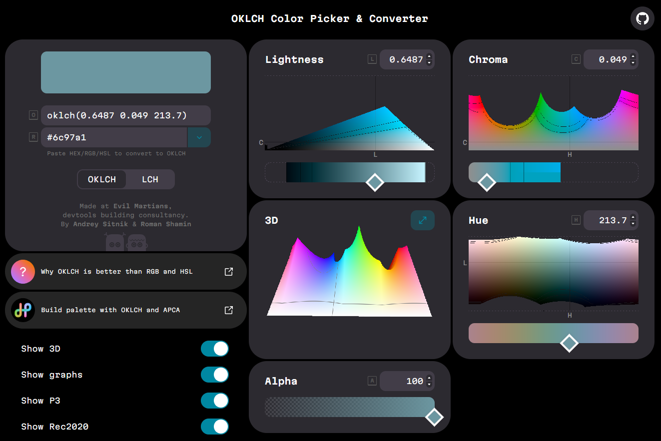
I get it, it's confusing, it's complicated, actually there's nothing wrong with HEXCODEs. But I've managed to eliminate the guesswork and a minimum of 7 iterations of palette development by simply accepting that not all colours are possible. Here's how it works:
OK - refers to the oklab colour system, the more RGB based precursor.
L - refers to perceived lightness and ranges from 0-1
C - refers to chroma (a purer measure than saturation) and ranges from 0 to infinite, although limited by screen display the value is usually below 0.37
H - refers to the hue angle, what colour it is! This goes from 0 to 360, which both encode the same colour. You remember how circles work right?
The important thing is that every hue has a different maximum chroma, as chroma is measured by comparing to a grey of the same lightness, whilst saturation measured in comparison to white. This is because of how sensitive the cones in our eyes are to different wavelengths, which is based on well, all of evolutionary biology. Fun fact, we can distinguish between the most shades of green, because we spent a lot of time around plants. The holes in the OKLCH mapping are representative of same limitations in our own colour vision and limitations in screen displays.

Doesn't this look so much nicer! I think that the colours seem to blend into each other much more seamlessly. Whilst this version isn't 100% perfect, I know it is because I am asking for colours that my computer screen simply cannot display and instead I am being shown the closest fallback.
If you want simpler models of colour that are as accurate to lived experience as OKLCH
you'll just have to wait for your eyes to evolve.
